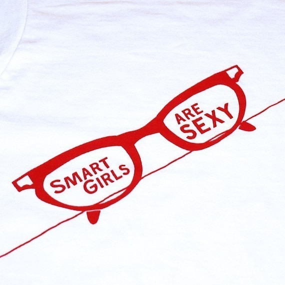
First impression: we need a major makeover; and by major, I mean bring out the wrecking ball, the bulldozers, and Miss Jay Alexander. We will start with the banner. I can understand if you are experimenting with Photoshop or another graphics program that the text effects are fun, but they aren't professional looking. I can see that font on a middle school Halloween Dance flier. It needs a lot of help. I will make one for you, should you desire. But that one is just bad enough, especially with your big black block of a box (how's that for alliteration?) you have pasted at the top of your page, to warrant you a
WTF!? Point. Your avatar is actually cute, though... so leave him!
The next prominent matter of aesthetics we need to discuss is the pictures. They are beyond terrible. The quality is not so bad, but they do not sell the products at all. It looks like you had a bunch of friends over, went through your mom's closet, and had a slumber party fashion show with her old digs. Go outside and sit in some tall grass in the sunlight and let someone photograph you or your models while they whimsically tie dandelions together to make a necklace or hair band. Go to a solid white wall and do some serious poses in a well-lit room filled with natural light. Your items don't seem "for sale" or like you're wanting them to look special. The way the pictu

res have been taken is like someone is messing around and playing dress-up in silly old clothes. If you want customers to buy your clothes and accessories, then you have to have to make them look special.
Let's examine some of the bad photos:
This is probably the worst-photographed item in your shop. Look at this picture: 98% face, 2% product. And this is not a shop-worthy picture. Bad lighting, terrible angle, and it looks like you even used a flash! See the detail in the earring? No, you don't. You can't. The picture is too bad!
And then you have a different person wearing the same pair of earrings! I think a lot of people are bothered by seeing earrings on someone else. Granted, if they are vintage they have probably been worn before, but that can make some people skiddish.

The worst, though, is your close-up shots. So blurry and yucky. Never use wood or faux wood as an indoor background for pictures.
When you saw this picture on your computer, you should have right-clicked on it, selected the delete button, then immediately went to the recycle bin and emptied it.
I have a guide for photography which can be viewed by
clicking here.
And descriptions... You are an excellent writer, and I envy your natural knack for describing your wares; however, it seems that you downplay the glamour or appeal of many items right before finishing the listing. For example, with the same pair of earrings listed above, here's what you have:
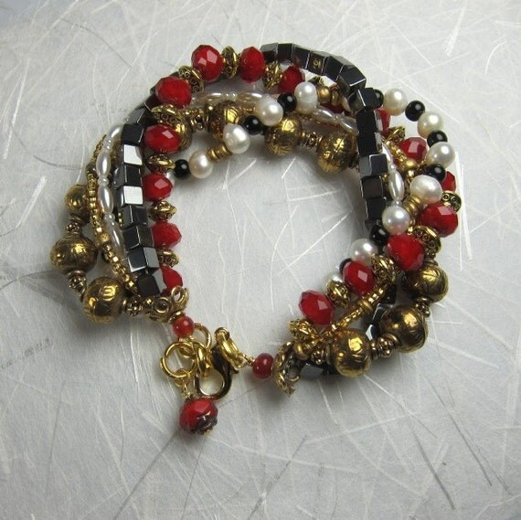
These are gorgeous pierced earrings from the 1960's. Silvertone metal, faux pears and irridescent rhinestones, make for a very glamorous look even though I must admit they always made me think of snowballs.
These earrings used to belong to my mom and they are in excellent condition. I've always loved them,
That was all fantastic. Photographed properly, these leverback vintage earrings have easy selling potential on Etsy; however, you had to follow up with this:
but the truth is they are too heavy for me which is why I think I only wore them once, and I think she gave them to me over 20 years ago. A lifetime of several hoops in my ears left me with no tolerance for big dangling vintage earrings which is why I have quite a few more in my shop.
You just told your potential buyers that you find this item intolerable and bulky. You don't have to be dishonest, but some people want big and bold earrings. Say something about how the earrings are for people who want to stand out. Never tell people you're parting with your items because you don't have use for them or don't want them. You went from boutique to thrift store when you did that.

And, if you are selling previously-worn earrings, explain to your shoppers that you sanitize them, or even offer to put new hooks on them.
This lilac gingham dress another example of the kind of image you shouldn't use. >This is an adorable vintage prize, but the presentation doesn't do it justice. The model's facial expression looks miserable, like some serial killer has her held up in the basement making her wear his mothers old clothes and pose for a camera. This model could be great for pictures, but the theme is just glaringly awkward. Your models should be smiling, posed artfully, and doing things people would do in a dress like the one in the picture.
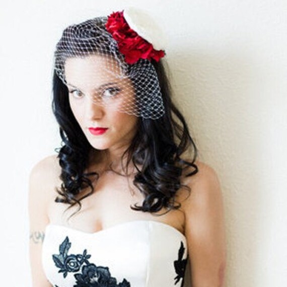
The black and white vintage hat: brilliant! What a fabulous item! With the right presentation, you can easily get $40 out of it.
Let me point something out to you. Take the picture below:

This model is gorgeous. Look at that long, elegant neck and those full lips. Dress her up, put on a little lip gloss, and do this hat justice. This hat is front-page worthy and is in excellent condition for vintage. A little black dress, a cocktail table, some red lipstick... something! I have seen similar items, not as nice as this, sell for more than $100 on Etsy. This is one of those items that needs to be photographed with a little red for contrast and against a bright, glaring white background.
And you have another, "this is great, but..." clause in your description. Any time you have the word "but" in a description, just go delete it right now. That's priority number one.
I'm going to post your shop announcement in its entirety and respond to lines individually. My responses are in red.
My shop is really a big combination of things, hence the name.
You are an inventive writer. Don't use the words "big" and "things." I will be posting some of my own artwork as well as a a lot of stuff from my vintage collections.
Don't say "stuff" either.I am a big
big again fan of vintage and have a big
big... really? collection of clothes, jewelry and other random things
things is now a banned swear word and have been collecting them since I was in high school. The problem is, that's a lot of stuff
so is stuff, and I've run out of space. Add to that the horrible realization that I really shouldn't wear at 40 the same same mini-dresses I was wearing at 20
do you realize you just lost an entire demographic of middle-aged women by saying that?, and I'm left with a bunch of stuff okay, don't say bunch either. and what's up with all this
"stuff" stuff? stuff has the same negative connotation as "junk" on my hands that I really need to part with
instead of saying you're parting with your items to save space, say that it's time to share your decades of fashion legacy. I try to keep my prices low, that way I can get rid of them faster
don't say "get rid" either. you make your items sound undesirable; you get a good deal and and the stuff
NO MORE STUFF! HOT DAMN! gets put to good use - everybody wins!
If you're adding a note about your prices, then give a better reason. Call it "recession-friendly," or talk about how everyone deserves to own a piece of pop culture history. They do, right?Most of the vintage clothes I will be posting have been in storage for quite some time, so I will be washing everything before I even take any photos. You might not get a mint item that has never been tainted by modern soap, but at least you'll know it's clean.
Scrap this paragraph and just mention that your items have been cleaned and have been stored in a pet-free, smoke-free environment. There are a few innuendos around your shop which suggest that there is something negative about being 40. Really be mindful about making an age (any age) seem like something undesirable. Even if mainstream models are generally between 17-23, Etsy's consumer base is not the mainstream. As long as you present yourself and your models as elegant or fun or quirky and confident and beautiful, then your customers will feel like the items they're buying are something that will make them feel the same.
If your camera sucks, then take advantage of natural lighting and go outside. Practice, practice, practice. Approach your picture-taking with the same artful consideration and precision you use when you create your art.
You're going to need a lot more items before you can expect to make many sales on Etsy, but items like some of your clothes and that black and white hat will sell quickly when you have them presented well. Your avatar is cute, but how does it relate to your shop? That hat needs to be your avatar. ;-)
I know I focus more on the negative aspects than the positive when I do these reviews, but I'm doing these to help you get sales. Put more of your artwork up, list more items, and work on your pictures [ a lot ]. If graphic design isn't your forte, then you can get a great banner made for your shop for five bucks all over Etsy. I see people offering free banners in the forums often, too. Etsy takes hard work, and your efforts have to be effective. You can spin your wheels and work your ass off, but if you're not taking the right measures, then you'll not get anywhere.
And work on that bio! One line? That's all there is to you?


 Shop Name: Rogue Magnolia is perfect for your shop. The "rogue" suggests that it's edgy, daring, and progressively fashionable, while the "magnolia" tempers it back to a refined, feminine image. With your products, the edgy/floral amalgam is perfect. Kudos to that.
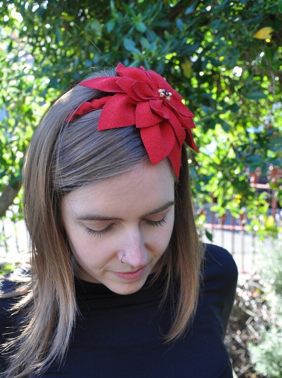 The focus of your shop is your dome, not your flowers. Almost every picture is a picture of the top of your head. It is overwhelming... just heads everywhere. And why are your eyes closed? Are you in rapture at the luxury on your head? While some people may not mind the fact that the hairbow they are buying has been on someone's head, it certainly bothers others. I would stick with just putting one picture of you with a hairbow on (pick a fave), and put that same picture on every listing at the bottom. Leave a note in your item descriptions that says the last picture is an example of a similar hair flower, shown as an example. Make your products take the spotlight, not the top half of your cranium.
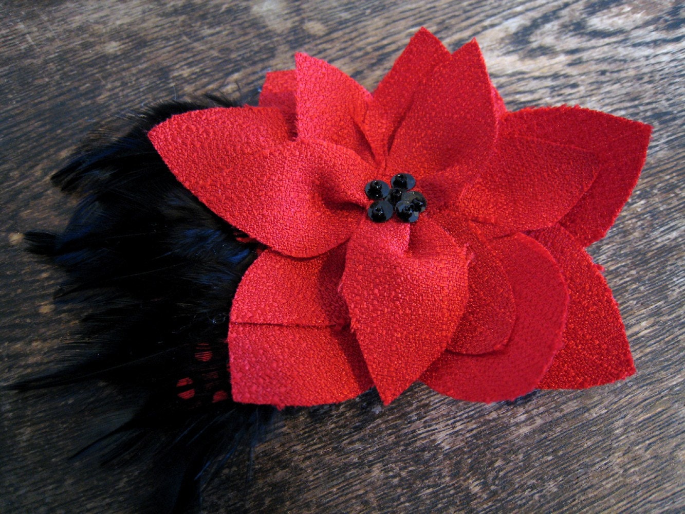
  There are some shots, though that would be much better options to use if you are going with the live models for display of your products. I think the image (above left) with the poinsettia is much more marketable than the awkward decapitated forehead shots.
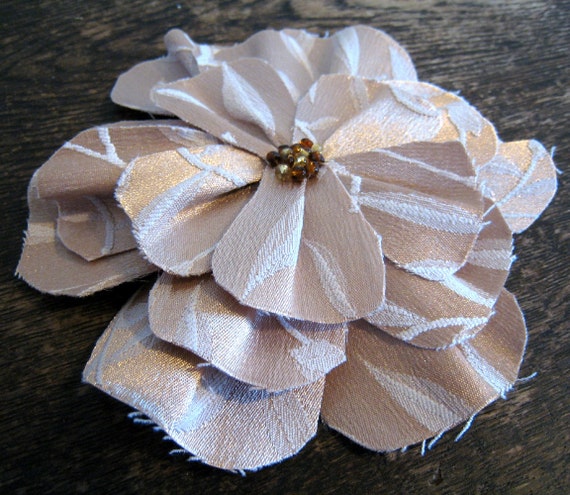 Sometimes, though... wood isn't a bad thing [ insert jokes here ]. For example, the natural, dark grain you have as a backdrop for some of your pieces is rustic and has character while providing a brilliant contrast for your products.