

First impressions matter a lot, and we all know this to be fact. Even the enlightened capitalists who buy handmade on Etsy can't escape the urge to be visually stimulated and wowed by visiting our stores before spending their hard-earned dollars from being a barista or shelving books.
And, your shop makes quite an impression. Let's examine why...
 Shop Name: Rogue Magnolia is perfect for your shop. The "rogue" suggests that it's edgy, daring, and progressively fashionable, while the "magnolia" tempers it back to a refined, feminine image. With your products, the edgy/floral amalgam is perfect. Kudos to that.
 Banner: Your banner is perfect. It looks like it should be on the cover of a visually striking indie film about forbidden love in South America. I dig it. The font, the colors, the contrast... very clean, sharp, and it matches your shop's theme. It suggests just enough malice to be enticing without crossing the border into risque.
Overall shop appearance:
It should be clear that your products are the focus of your shop, but it's not... and this is where you get your first WTF!? point.
 |
| Damn, that's a lot of head! |
 The focus of your shop is your dome, not your flowers. Almost every picture is a picture of the top of your head. It is overwhelming... just heads everywhere. And why are your eyes closed? Are you in rapture at the luxury on your head? While some people may not mind the fact that the hairbow they are buying has been on someone's head, it certainly bothers others. I would stick with just putting one picture of you with a hairbow on (pick a fave), and put that same picture on every listing at the bottom. Leave a note in your item descriptions that says the last picture is an example of a similar hair flower, shown as an example. Make your products take the spotlight, not the top half of your cranium.
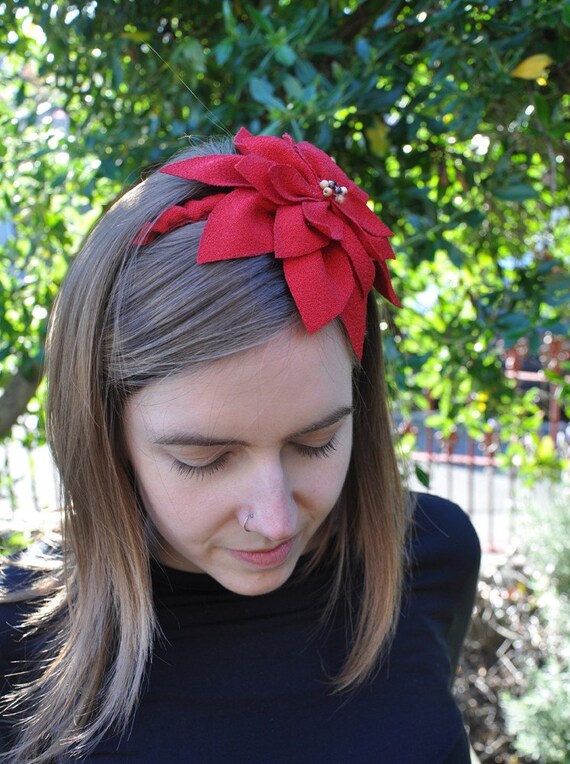
  There are some shots, though that would be much better options to use if you are going with the live models for display of your products. I think the image (above left) with the poinsettia is much more marketable than the awkward decapitated forehead shots.
The way your brooches are photographed is great. The snazzy dress form suits your flowers. I'm not loving the wood grain in the background, though. Don't you have some drywall somewhere? Drapes? A shower curtain?
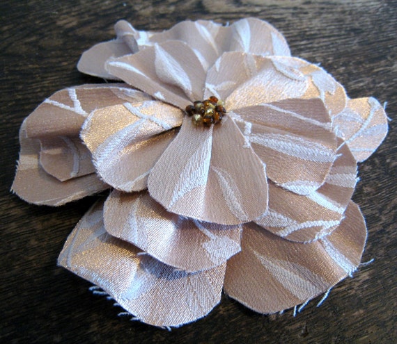 Sometimes, though... wood isn't a bad thing [ insert jokes here ]. For example, the natural, dark grain you have as a backdrop for some of your pieces is rustic and has character while providing a brilliant contrast for your products.
 Photography:
Overall, the photography is fantastic. You have used natural lighting, which makes for accurate color representation, an uncontrived balance of light and shadow, and simply more attractive images.
Pricing:
I'm a little concerned about the pricing of your items, not because I don't think they are worth the price, but because the competition on Etsy has them priced generally lower. While Etsy is a global market, the majority of Etsy shoppers and sellers are in the US. You are already battling with them over vicinity, but then your prices are higher than the average US flower brooch/headband sellers. You should certainly make shipping free, or lower your prices. The second item should ship for free.
You are just going to have to make a decision about whether you want to sell them for what they are worth to you, or whether you are going to lose business to desperate people selling them for less.
Wrap-up:
Your products are great, and with a little tweaking to your marketing (and maybe your pricing), you should see a lot more sales come your way. I think one major thing that will increase the volume of your sales is to simply increase the amount of products you have available. You have a better chance of someone finding just what she was looking for on your site if you have more designs from which to choose. Put your dress form in front of a plain wall next time you take a brooch picture, and stop chopping off your own head!

YAY thanks so much for the feedback. Pleased my banner and name meet with approval. LOL glad that some wood-grain is OK. Agreed my head is a little weird... But admittedly some of the HUGE etsy sellers in the category of hair pieces also photograph everything on live models and I suppose I felt I had to do the same... : D Hoping to add some new products in the upcoming month(s) so your review is timed perfectly for my re-vamp (note, new items will not be hair-related so that should alleviate some issues!). Will also reconsider my prices. Thanks again - your feedback is very helpful! : D
ReplyDeleteP.s. Love the indie film banner. : D
ReplyDeleteYay so happy I found you again! Don't ask me how I'd lost you, but I did. This is a nice review- I agree with most of it- I do think hair products need to be seen on a head for scale, but one photo would do, as you said. As long as the items are all about the same size. Good to "see" you Rogue!
ReplyDelete